The Felix Gärtner Color System
Powerful. Relevant. Revolutionary.

Whether you struggle finding the right green for your first Lamborghini, the perfect brown for your first wig or you just need to be on top of the color game because it is your job to design futuristic stuff and you want your color choice to be a statement - The Felix Gärtner Color System got you covered! It was about time to present a contemporary alternative to this whole Pantone thing anyway.
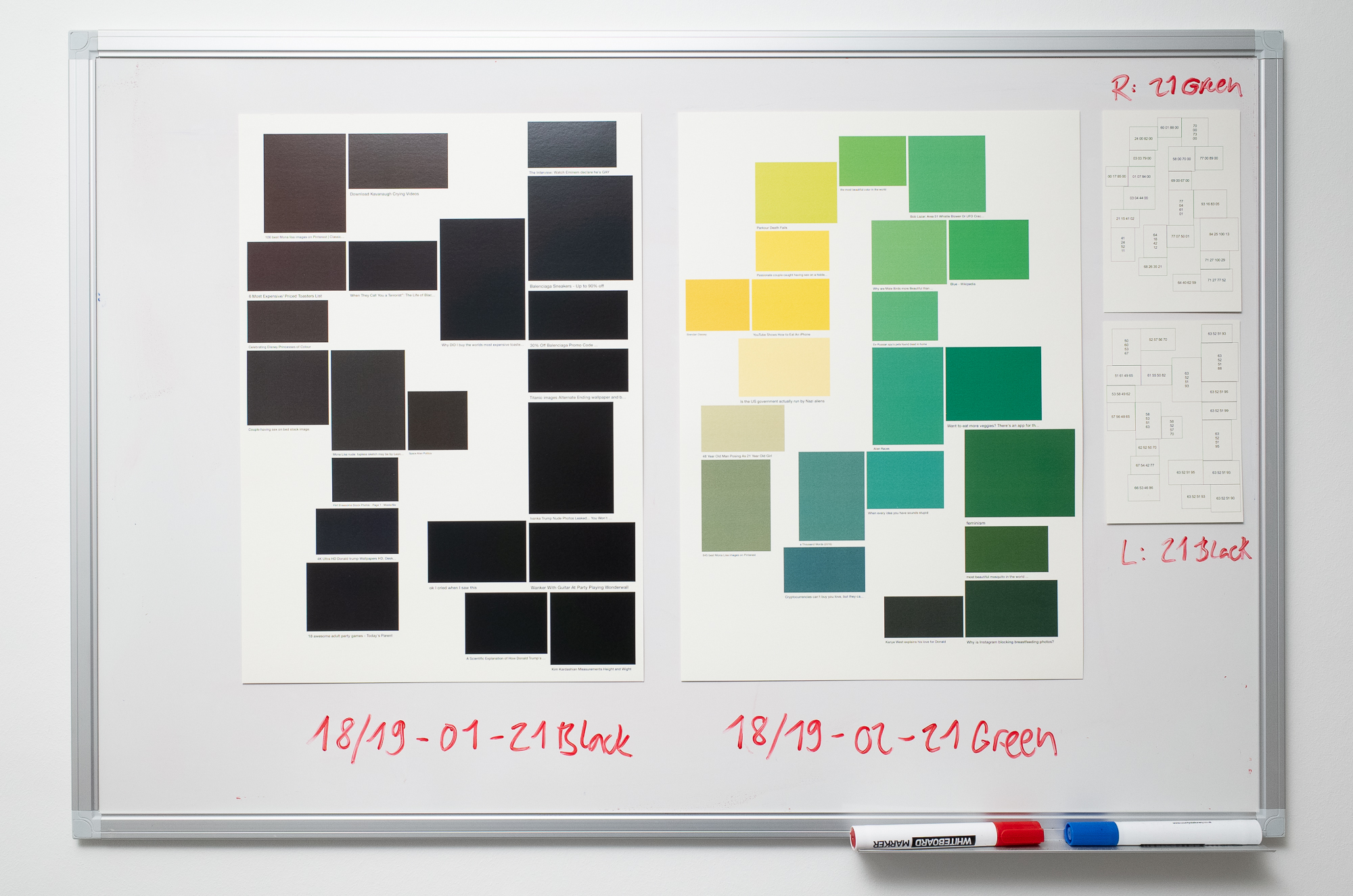
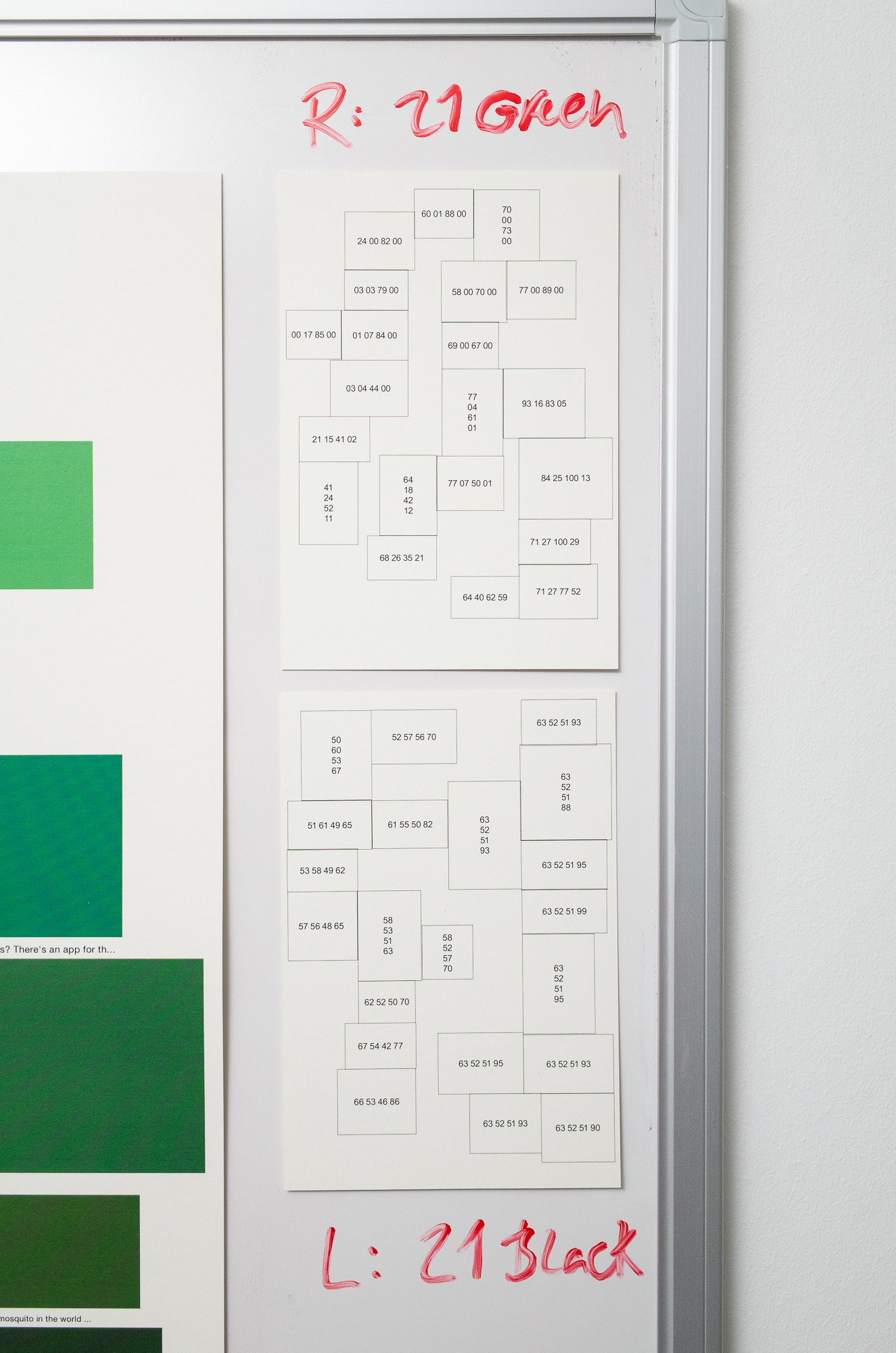
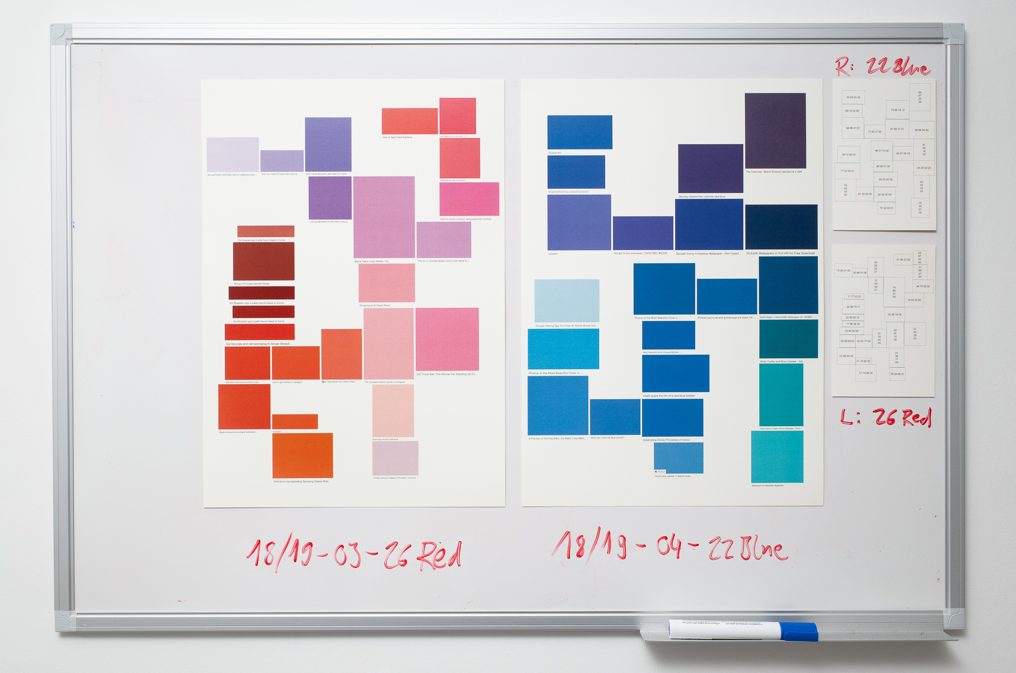
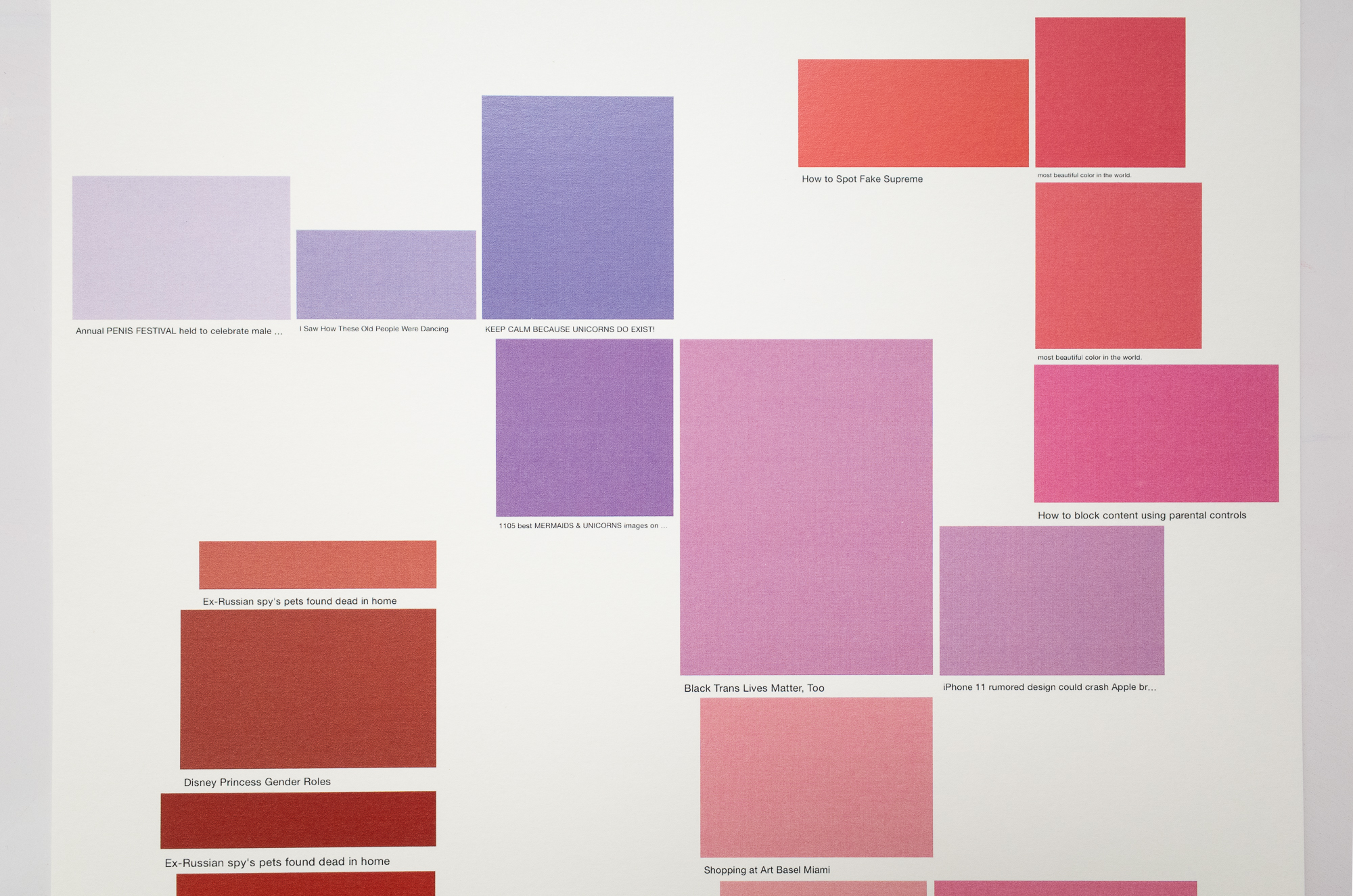
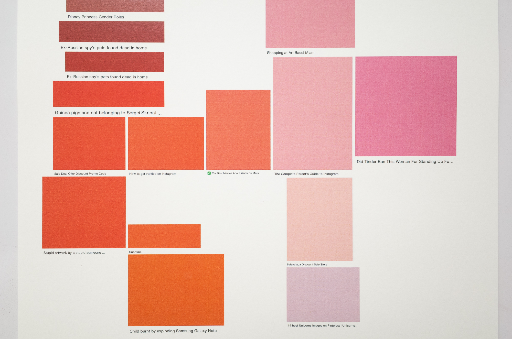
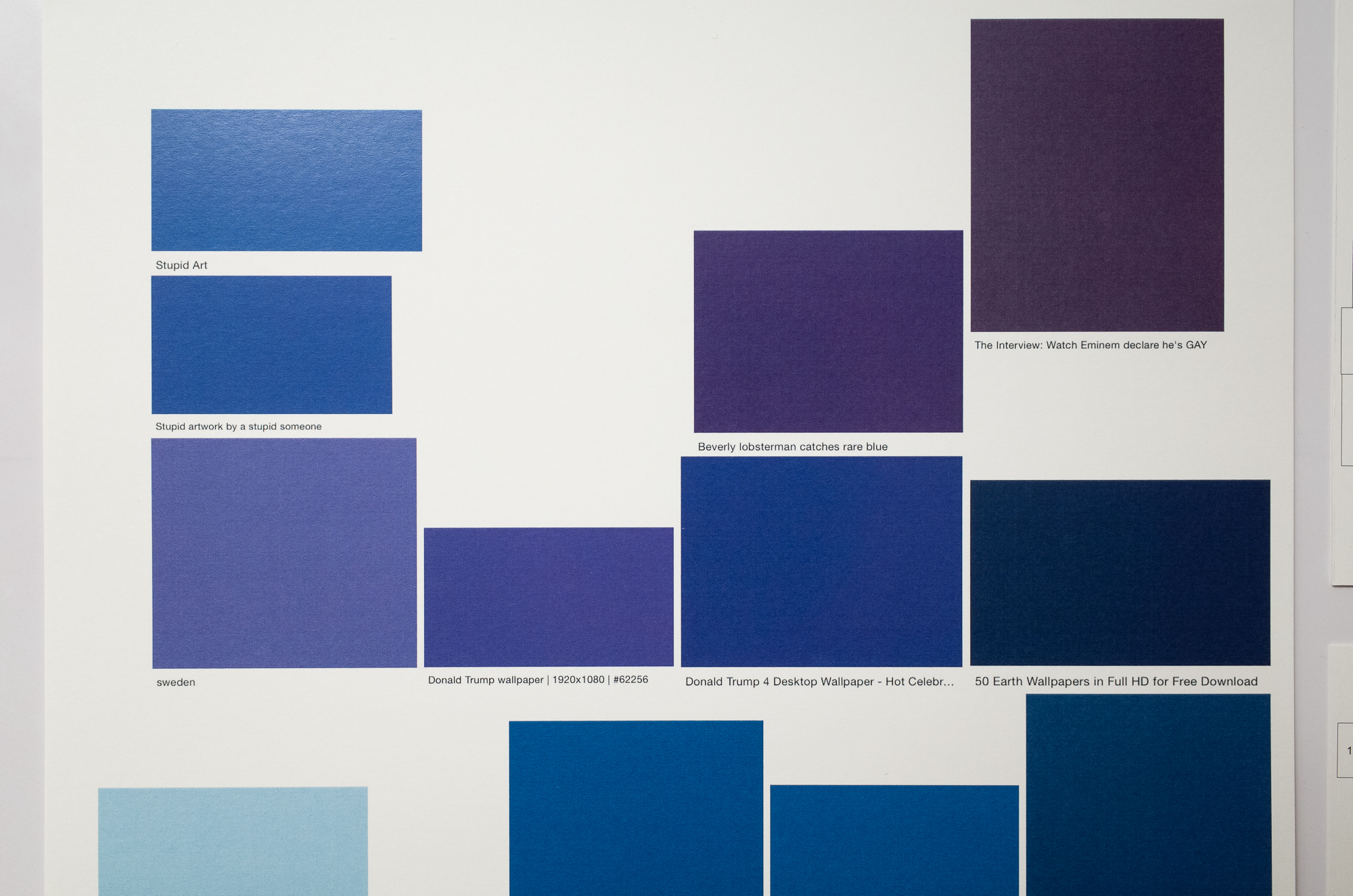
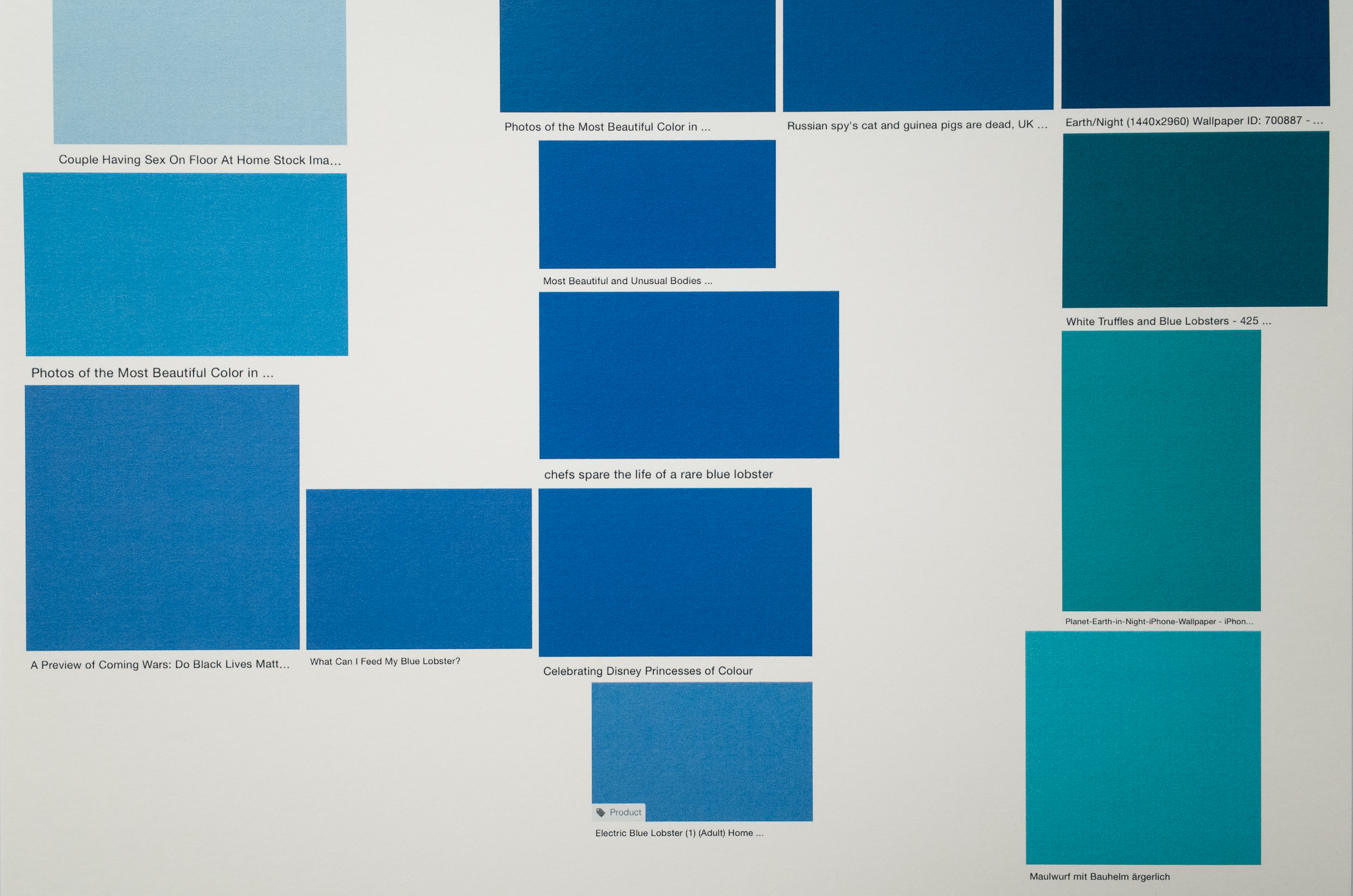
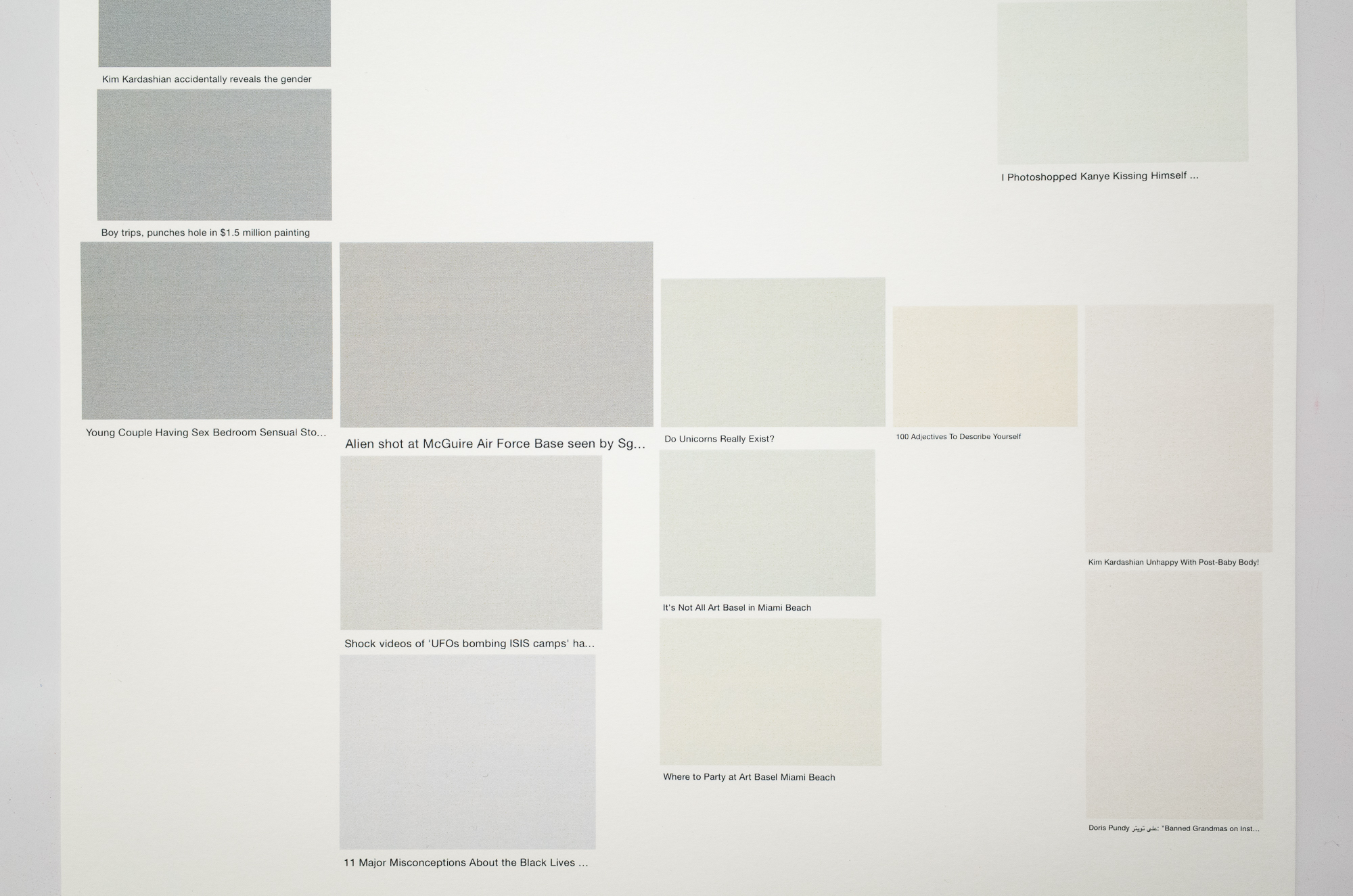
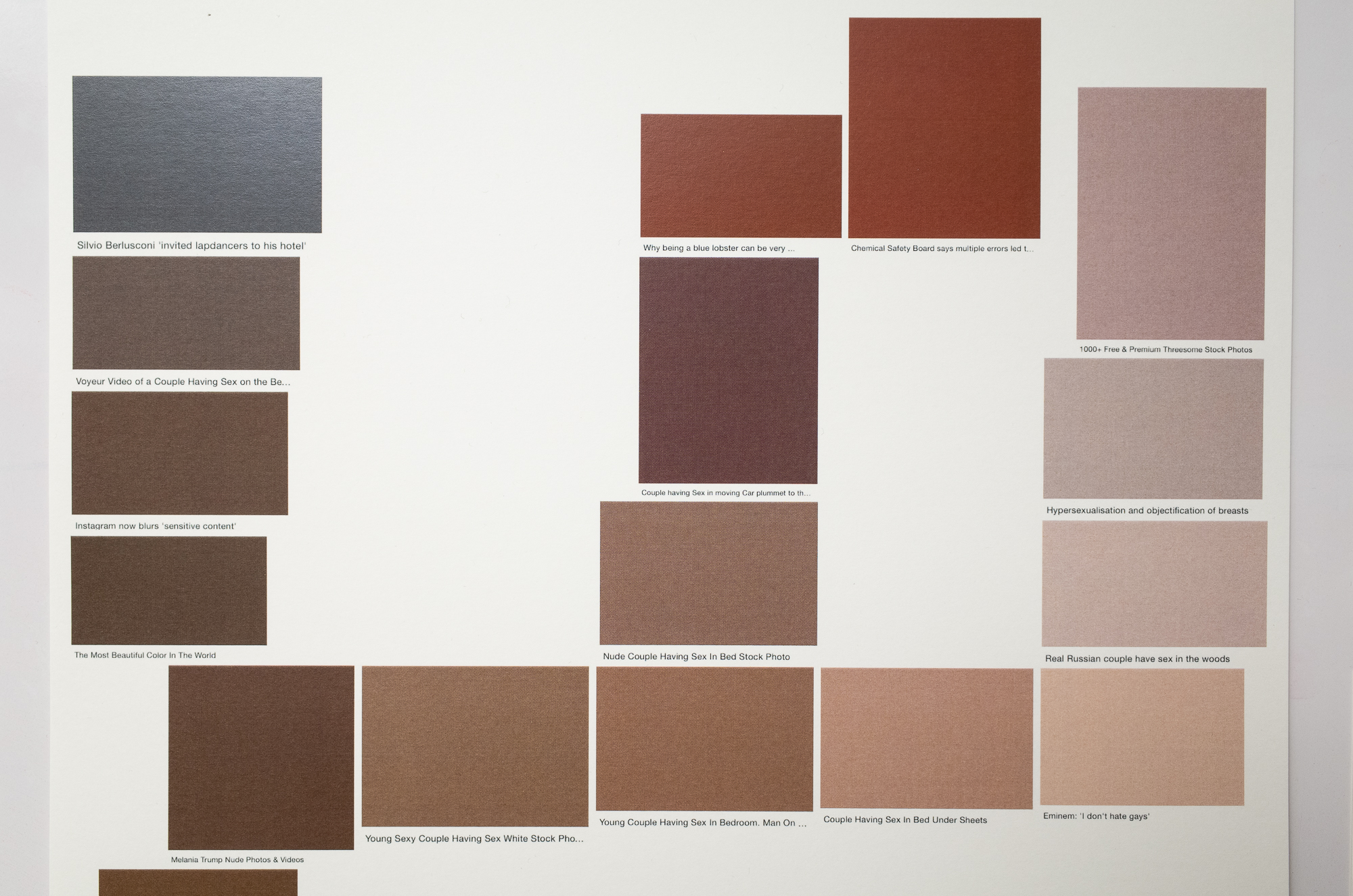
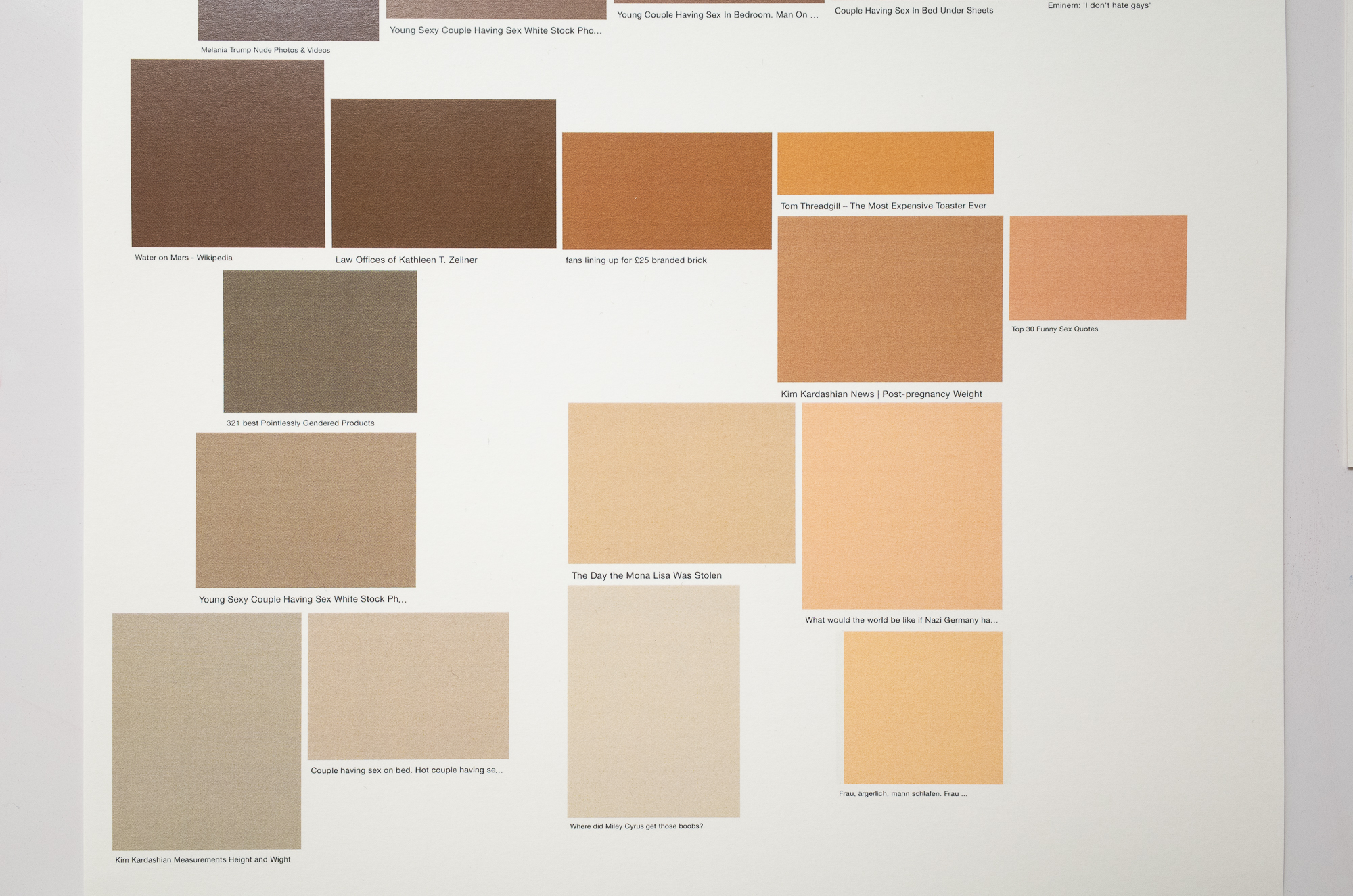
The Felix Gärtner Color System can be seen as the metamorphosis of the artists work 'almost there' which was created between 2015 and 2017. Both works consist of screenshots taken during online image searches on Google.
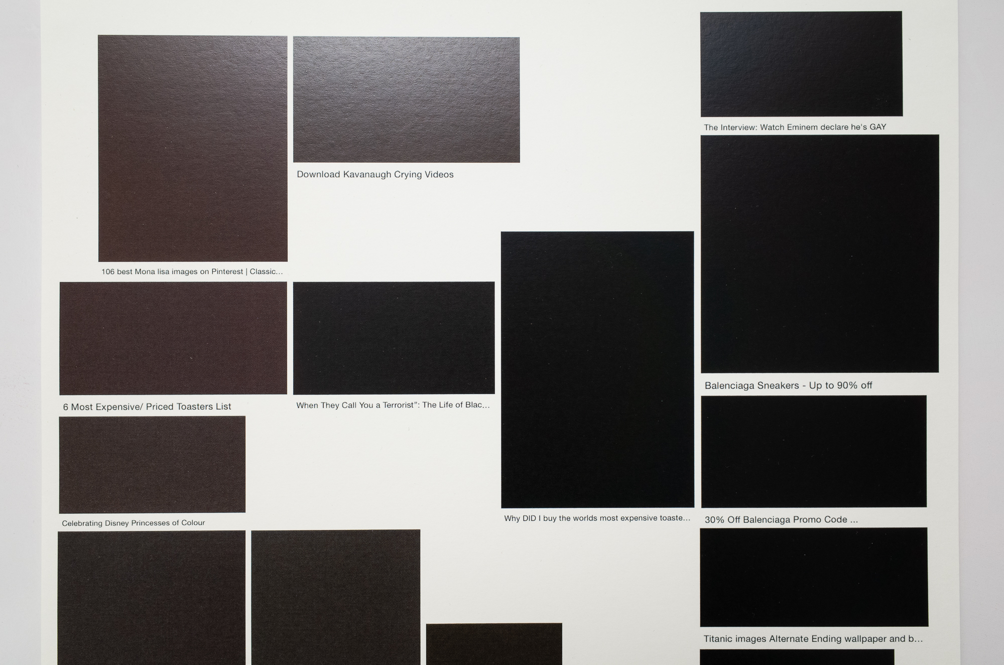
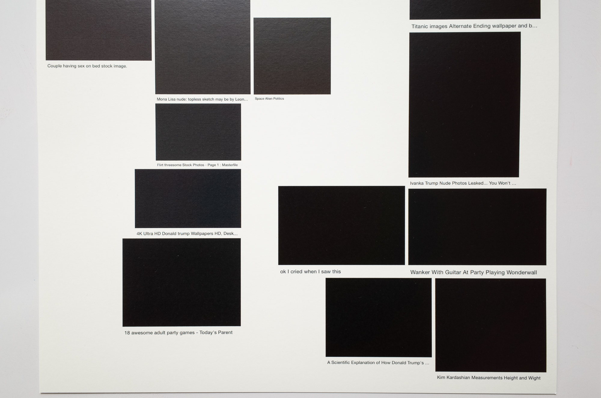
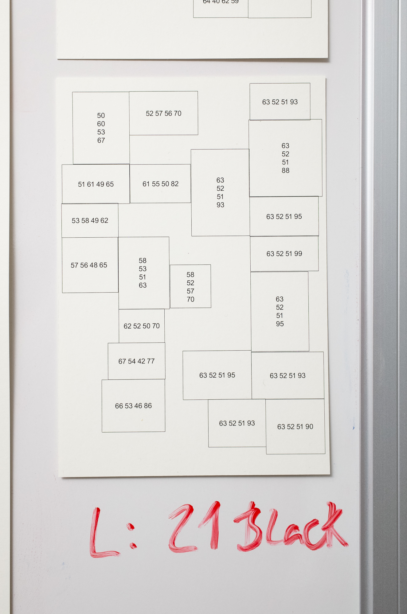
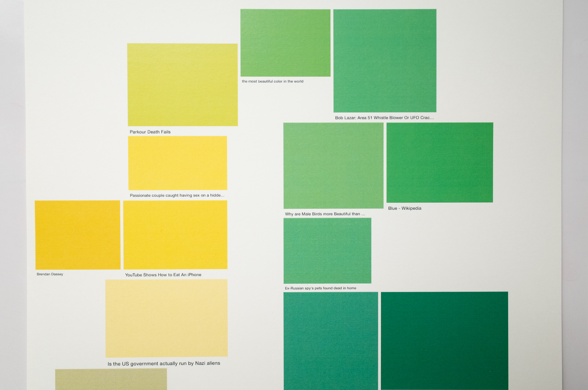
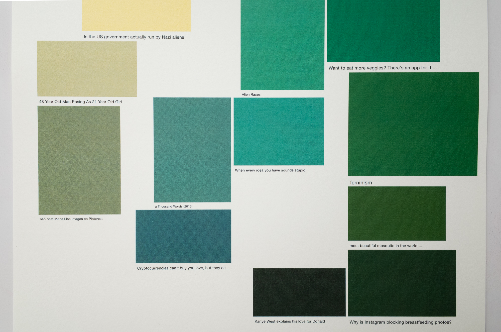
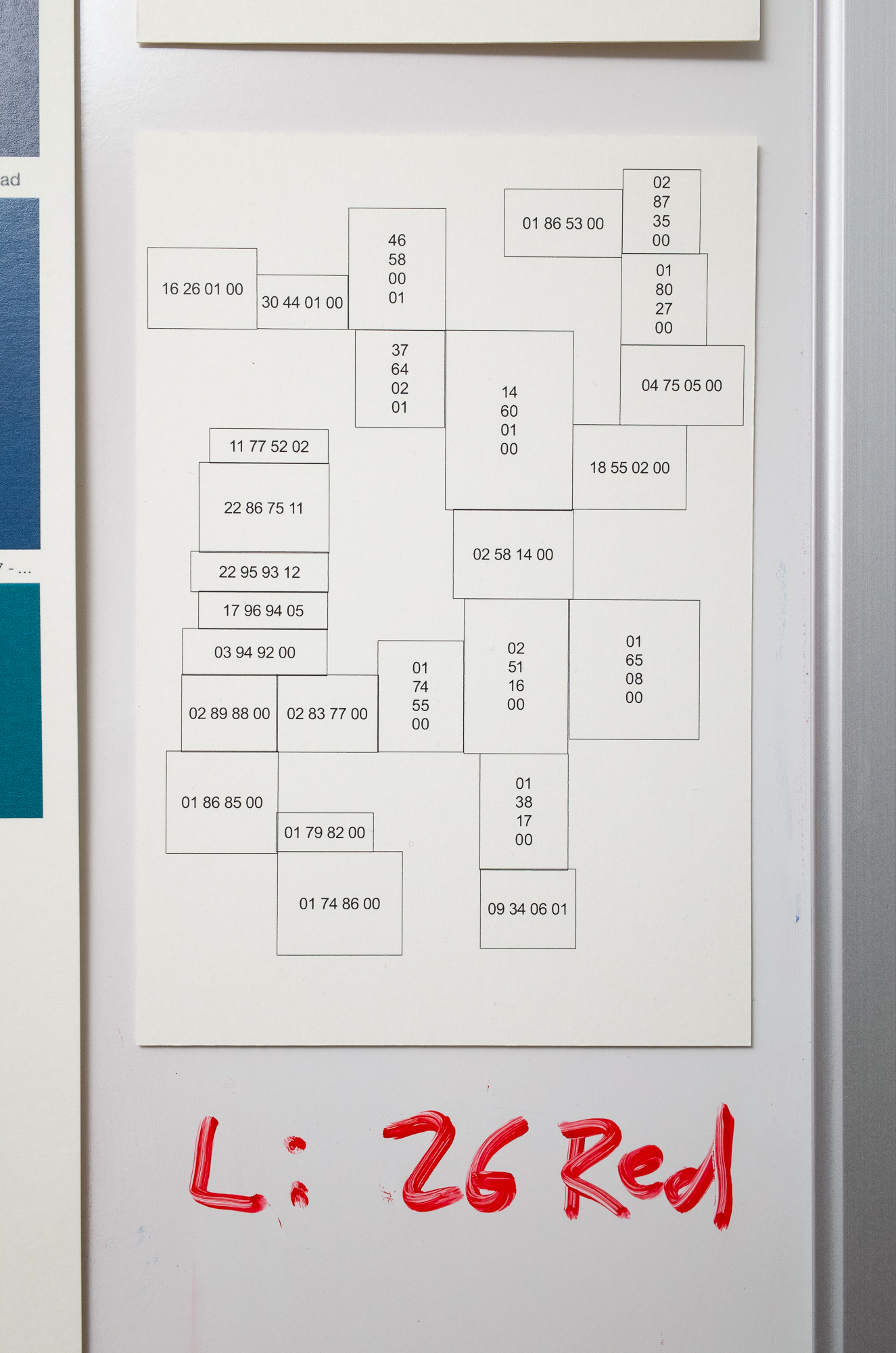
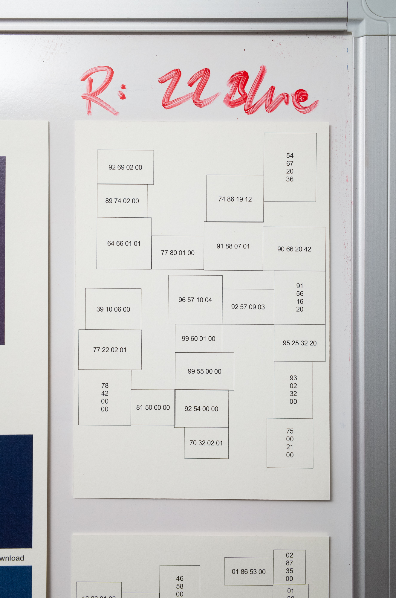
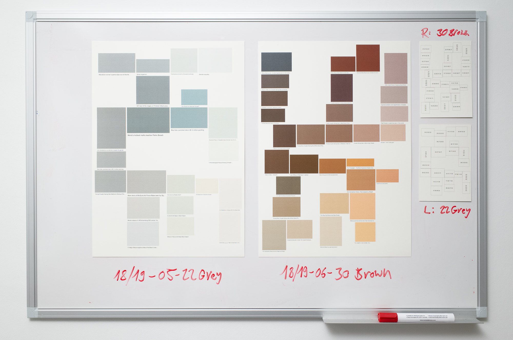
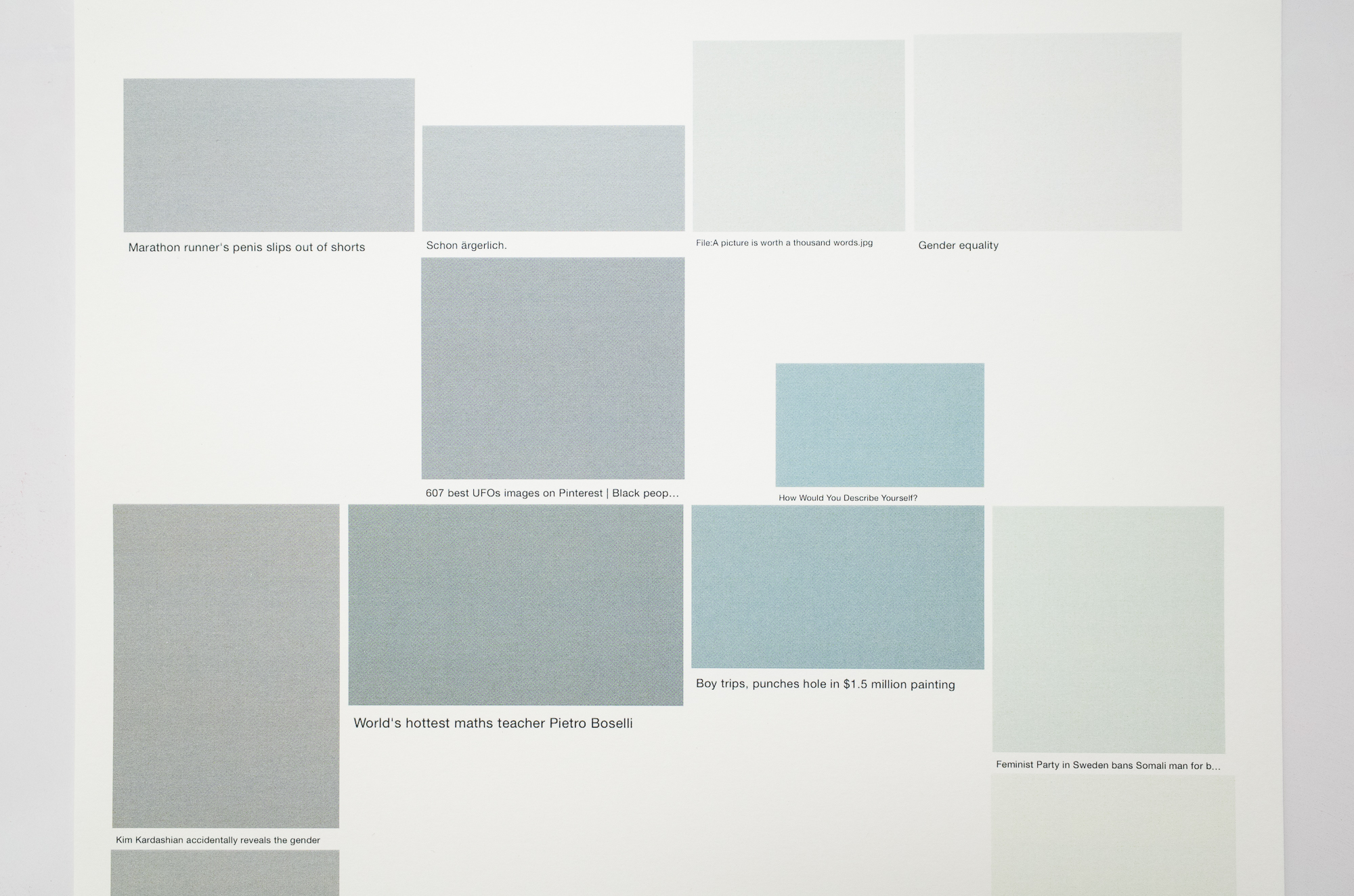
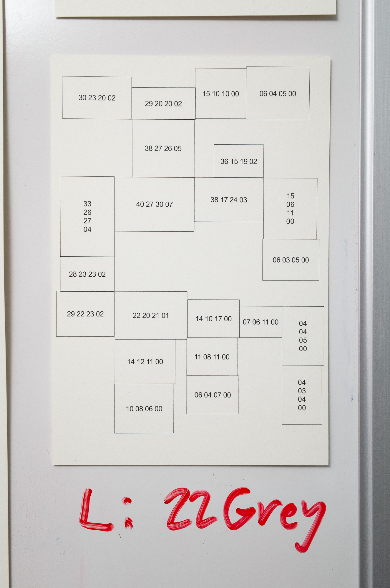
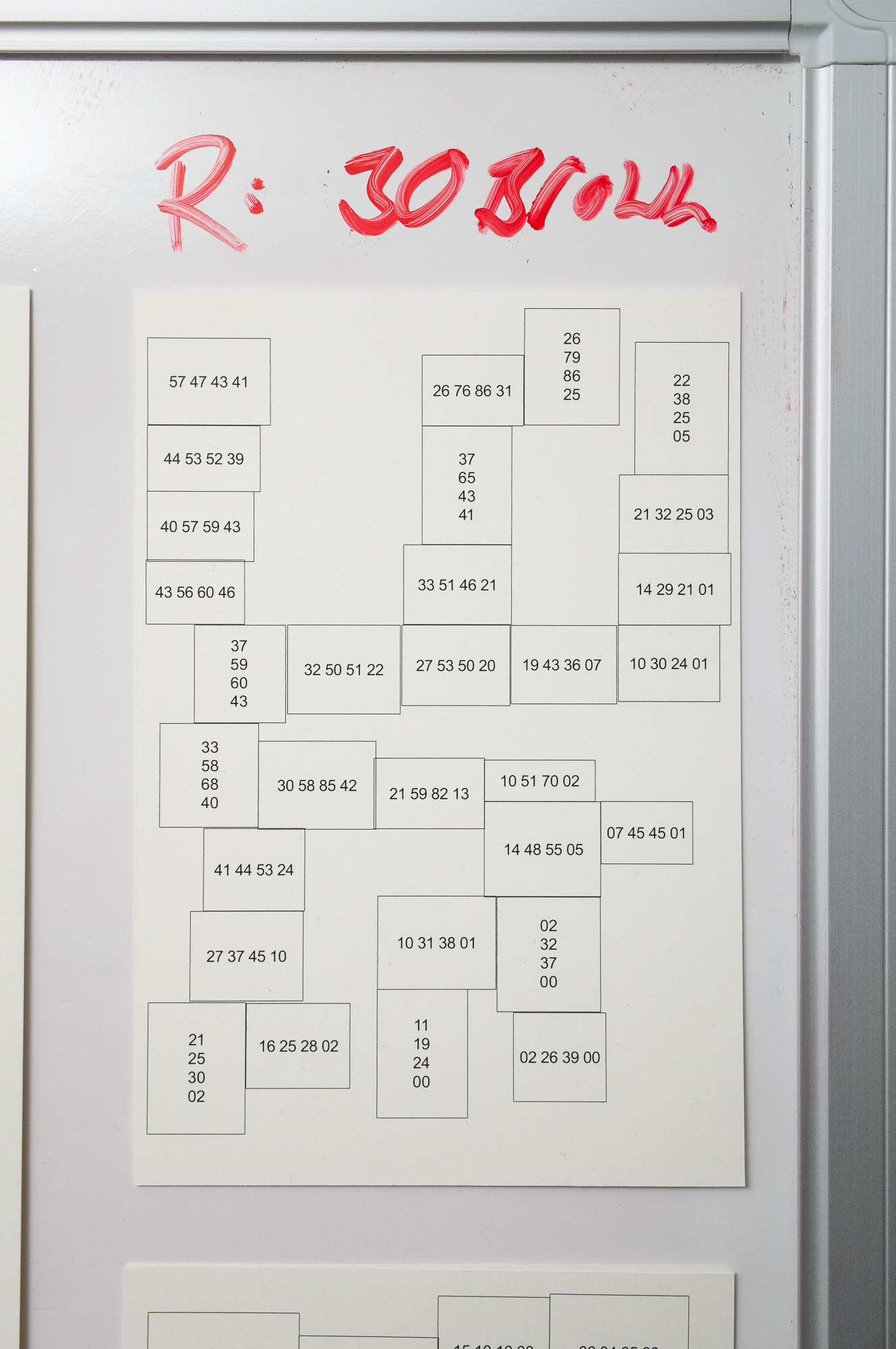
These screenshots capture a moment in between that becomes almost unnoticeable when using a modern internet connection. While the page is loading - the split second before the actual search results are displayed as thumbnails - each image is represented by a single algorithm generated color field. Felix Gärtner's work 'almost there' is a series of screenshots in which the arrangement of the color fields inside the frame as well as their colors reflect the initial search term. The project ended in late 2017 when Google changed its layout by adding captions below every image. This newly emerged contrast between descriptive text and the significant reduction of visual information of images provides the basis for the Felix Gärtner Color System. It comprises six panels, each is a collage of several screenshots, containing just one color field plus its caption. Gärtner's work visually mimics historic color systems, such as the 'Munsell Color System', Ridgway's 'Color Standards and Color Nomenclature' and more modern ones like the 'Pantone Color System'.
The artist draws the content for this work from the seemingly infinite, ever evolving cluster of ones and zeros, the most significant accumulation of information in the modern world, the rich digital source of inspiration - the internet. In theory, this color system could expand constantly with every single one of the two billion images uploaded to the world wide web every day, creating new color-text-combinations.
The central theme of the work is the disruption of the superficial harmony that is suggested by the visually satisfying arrangement of colors. As soon as the viewer starts reading the 'names' of the colors, this harmony falls apart and the attention starts shifting from the color-text-contrast to the even greater content-based text-text-contrast. Gärtner selects fragments of the vast amount of filtered and unfiltered content presented to us in everyday life across all types of mass media. He forces elements of pop culture and the social media world to collide with some of the most pressing issues we find ourselves presented with in todays society. The Felix Gärtner Color System is an attempt to illustrate the exhausting and frustrating task of processing this enormous stream of information and trying to make sense of it.
Anyway, it is a great conversation starter, too, as these examples show: “Have you noticed that we repainted the facade in 'Where did Miley Cyrus get those boobs'?” and “I wish there was an iPhone XR in a nice green tone like 'Blue - Wikipedia'!”